The power of RAL Colour Feeling 2026+ in laminate design
The RAL Colour Feeling 2026+ report presented by Munksjö introduces a forward-thinking color palette featuring 15 trend-driven shades designed to inspire confident design decisions across diverse industries, from architecture to retail. Traditionally recognized as a color-coding system for the paint industry, RAL has expanded its reach to address a broader spectrum of design needs, including textiles, ceramics, plastics, and surface coatings.
At its heart, RAL’s mission is to guide sustainable and innovative design, fostering a shared language for the future of color. With the RAL Colour Feeling 2026+ report presented by Munksjö, we offer trendy solid-color décor paper solutions for laminate surface materials, enriching applications across kitchens, bathrooms, residential spaces, and office furniture.
Learn more about Munksjö’s approach to incorporating these trends in an interview with our own executives Sébastien Alainé, Head of Marketing and Communication and Didier Galerne, Consultant Art Director.

Q: What new possibilities do these colors offer for interior spaces and furnishings?
Sébastien: This palette addresses diverse design needs, from casual, relaxed atmospheres to bold, sophisticated décors. It includes versatile neutrals and richer, warmer tones, enabling both monochromatic and multi-color combinations. These shades are particularly well-suited for kitchens, bathrooms, and living spaces, offering designers a wealth of creative opportunities.
Q: Which RAL Colour Feeling 2026+ shades stand out for laminate surface materials?
Didier: Several shades stand out for their versatility and appeal. Rust Coloured, reminiscent of terracotta, remains a popular choice in interior design, especially for kitchens and living rooms. Peanut Butter, Pepper White, and Pearl Yellow bring a refreshing natural vibe. Cooler tones, such as Architecture Blue, Light Teal, Garlic Beige, and Olivine Grey, are ideal for modern kitchens and bathrooms, delivering a contemporary aesthetic. All these colours come with the corresponding RAL code so it´s easy to translate these colours into Munksjö designs.
Q: Are there specific color pairings or contrasts you find particularly innovative?
Didier: Certainly! For laminate surfaces, some pairings beautifully elevate designs while aligning with the tone-on-tone trend:
- Rust Coloured / Opaline Pink: Creates a harmonious and soft ambiance.
- Olivine Grey / Garlic Beige: Adds a sophisticated neutral tone-on-tone combination.
- Workshop Blue / Architecture Blue: Offers an unconventional and modern aesthetic.
- Peanut Butter / Pinkish Brown: Provides elegant, theatrical contrasts, perfect for kitchens and living spaces.
For those seeking a dramatic touch, Fox Red can be used as an accent to enrich any of these pairings. These combinations offer a versatile foundation for impactful interior solutions.
Q: Any final thoughts?
Sébastien: At Munksjö, we see the RAL Colour Feeling 2026+ report not just as a palette but as a tool to stimulate creativity and innovation. By integrating these forward-thinking shades into our solid-color décor paper portfolio, we aim to provide our customers with trendy solutions to help them design inspiring and successful laminate surface materials and furnishings.
Ready to explore this new color offer?
Contact our sales team for more information: munksjo.com/contact-us
Recent Articles
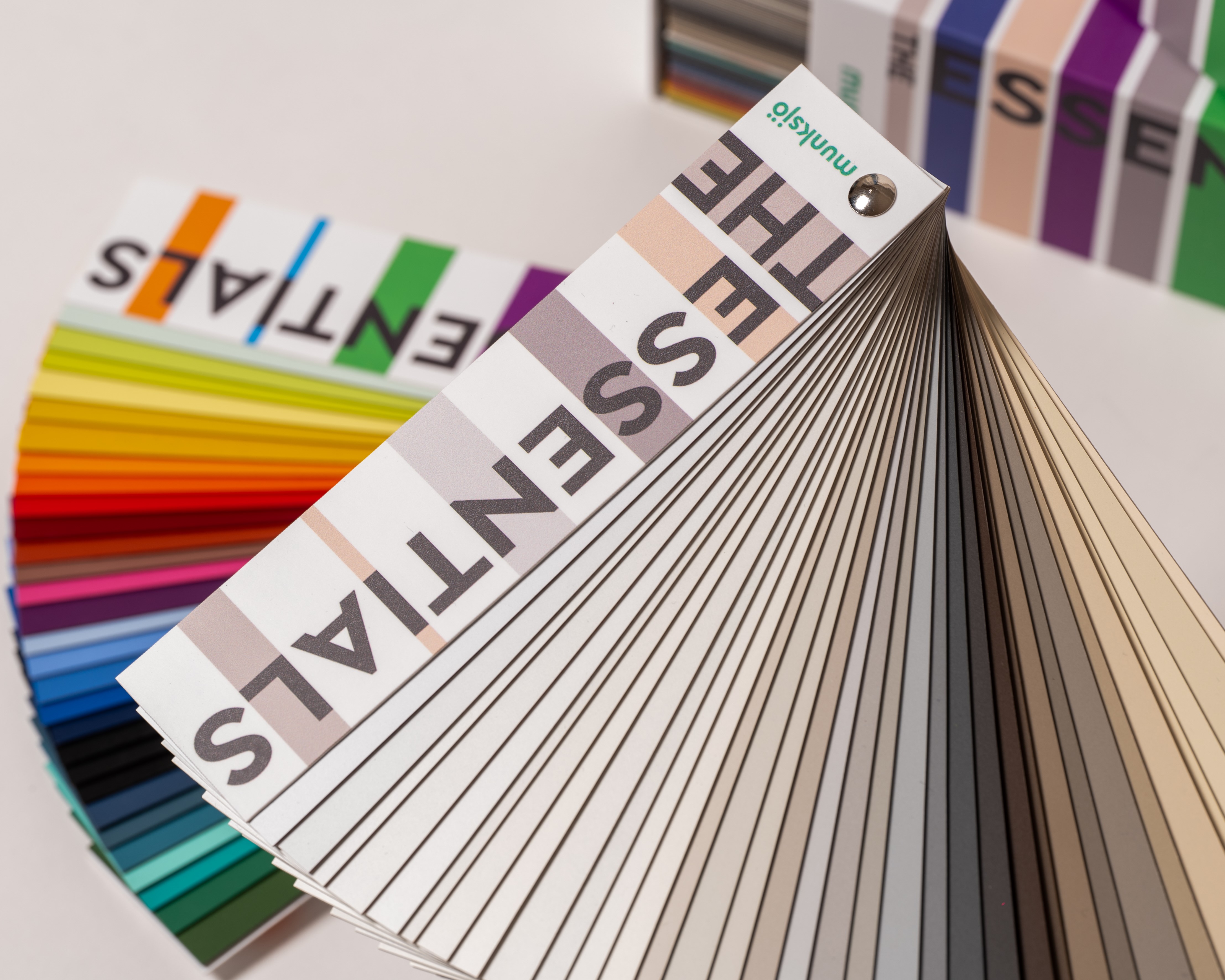
Meet “The Essentials”, Munksjö’s color collection specifically curated for the Latin American market
Munksjö is proud to announce the launch of "The Essentials", a new decor paper collection featuring…
OUTDOOR 3: Expanding color choices for exterior applications
Developed for HPL compact surfaces, the collection features 134 solid colors, providing architects…
Munksjö and the Turkish Market: Solid Colors and Global Reach
The Turkish market holds a special place for Munksjö, especially as it continues to emerge as a…
Press Contact
If you have any questions regarding Munksjö, our Corporate Communication team will be happy to help.


